Yes, I review WooCommerce plugin submissions on WooCommerce.com, and I keep noticing the same UX problems over and over. Most of them are easy to avoid. And when they’re avoided, reviews go faster, and users have a smoother experience.
And I think, it’s time to share what actually gets a plugin through review faster, and more importantly, what makes users genuinely love using it.
This isn’t about checklists. It’s about understanding why these things matter.
No private review process details. No behind the scenes rules beyond what’s already publicly documented and broadly expected in wp-admin. It’s simply what good usually looks like when you build for WooCommerce.
The first impression happens at activation
A plugin can be great, but still fail the first moment.
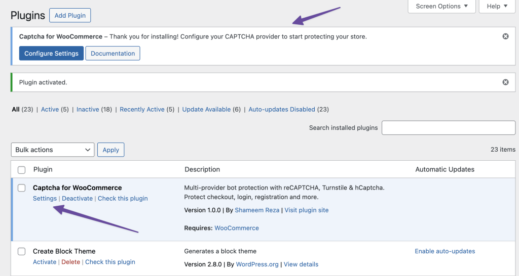
Here’s something I see constantly: a plugin activates, and suddenly I’m hijacked, redirected to some setup wizard I didn’t ask for.
It’s jarring. And if you’re activating multiple plugins at once (which users often do), it completely breaks the experience.
That feels like the plugin took control of my admin.
WordPress has clear guidance here. Don’t redirect on activation. It’s tempting, I know. You want to guide users. But there are better ways.
Instead, set a transient and show a dismissible admin notice. Something friendly like “Thanks for installing! Here’s how to get started”.
Add a Settings link in your plugin’s action row. That’s it. Give control back to the user. Let the user choose when to act.
If you’re building onboarding, WooCommerce onboarding guidelines explain this beautifully. A clear path to setup, without being pushy.
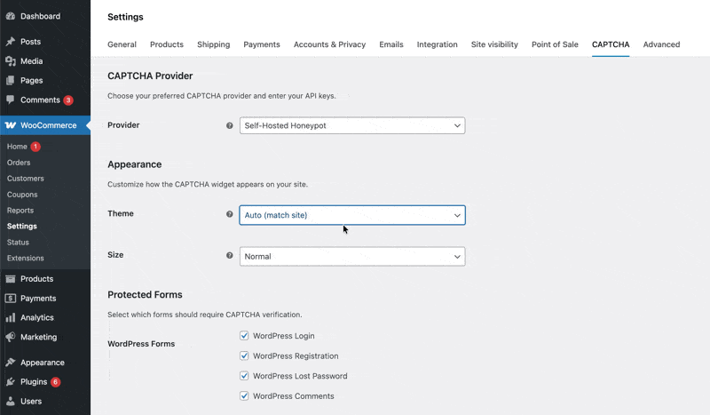
Where your settings live matters more than you think
This one trips up so many developers. You’re building a WooCommerce extension. So where should your settings page be?
Short answer: under WooCommerce. Not as a top level menu item. If your plugin is built for WooCommerce, your settings should feel like they belong to WooCommerce.
I get the temptation to make your plugin prominent in the admin sidebar. But think about it from the user’s perspective.
They’re already navigating WooCommerce menus daily. If your plugin extends shipping, your settings belong under WooCommerce → Settings → Shipping. If it’s a marketing tool, put it under Marketing.
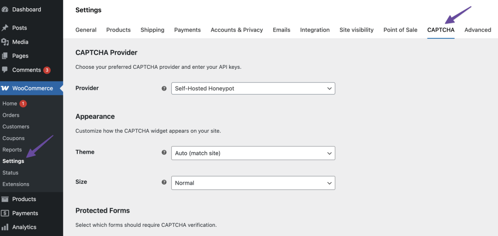
The rule is simple: 99.9% of WooCommerce extensions should live within the WooCommerce nav structure. The only exception is if your plugin genuinely doesn’t fit anywhere, and even then, think twice.
Top-level admin menus are almost never the right move for WooCommerce extensions. They add noise. They make the sidebar harder to scan. They also force users to learn a new structure instead of using the one they already understand.
Additionally, keep your menu label short. Under 20 characters. One line. Users are scanning quickly; don’t make them work to understand what your plugin does.
The WooCommerce navigation guidelines have more great explanations and visual guidance on navigation.
Looking Native Isn’t Optional
Native styling is not about looks; it’s about trust.
Here’s where I see the most passion from developers, and where things often go wrong.
Many plugin developers love to style their settings pages with custom colors, branded fonts, and maybe a nice illustration or two. Some even make it heavier using the reactive style vibe for no valid reasons.
I appreciate the creativity, genuinely. But inside wp-admin, or even in the context of WooCommerce, it creates friction.
When a user opens your settings, it should feel like WooCommerce, not like a separate product living inside WooCommerce.
Easy soltuions is, use WordPress and WooCommerce admin components. Respect the user’s chosen admin color scheme. Don’t override global styles. Your plugin should blend in, not stand out.
And colors matter for accessibility. Text on backgrounds needs at least a 4.5:1 contrast ratio to meet WCAG AA guidelines. This isn’t pedantic; it’s about making your plugin usable for everyone, including users with visual impairments.
WooCommerce has great guidance on colors and accessibility expectations.
The Dropdown Problem
Trust me, dropdowns can ruin a good settings page.
Many plugins have settings with long lists of options. Countries. Product categories. Customers.
When you use a standard HTML select element with hundreds of options, it becomes nearly unusable. Good luck finding Vietnam in an unsearchable list of 195 countries.
The solution? SelectWoo.
WooCommerce uses SelectWoo for a reason. It’s a fork of Select2 with accessibility improvements. Searchable lists. Better keyboard support. Better overall control for long option sets.
It transforms a frustrating dropdown into something genuinely usable.
Small detail? Sure. But these small details separate good plugins from great ones.
No External Links. Seriously.
This is a hard rule for WooCommerce.com marketplace submissions: no links to your own website inside the plugin.
Not in the plugin header. Not in the settings page. Not in admin notices. Nowhere.
Why? Because when a merchant buys from WooCommerce.com, they’re customers of that marketplace. The billing, licensing, and support infrastructure are handled there.
Your job as a vendor is to build a great product, write documentation, and provide technical or presales support.
External links create confusion about where users should go for help.
This includes “Powered by” footers, links to your documentation, links to your support portal, and feature requests. All of it needs to point to WooCommerce.com resources or stay internal to the plugin.
Think deeper about the Problem
Before I wrap up, let me share something about plugin quality that goes beyond UX patterns.
The best plugins don’t just solve the obvious problem. They anticipate edge cases.
Let’s say you’re building a WooCommerce customer cleanup plugin. The straightforward approach: let users delete inactive customers. But what happens to their orders? What about related data in other plugins? What if something glitches and data gets mixed up? Is there a way to recover?
When you think through these scenarios, your plugin becomes genuinely valuable. First impressions matter, and reviewers notice when a plugin handles complexity gracefully.
The Payoff
Following these guidelines doesn’t just help you pass review faster. It makes users’s lives easier. It reduces support requests. It builds trust.
And honestly? It makes your plugin better.
When everything feels native, when setup is smooth, settings are where users expect them, dropdowns actually work, and the interface respects accessibility standards, people notice. They might not articulate why they like your plugin, but they feel it.
That’s what good UX is about.
A short checklist you can use before submitting anywhere:
- Onboarding: No redirect on activation. Use dismissible notices. Add a Settings link.
- Navigation: Settings under WooCommerce menu. No top level items. Keep labels under 20 characters.
- Styling: Use native WordPress/WooCommerce components. Respect admin color schemes.
- Accessibility: 4.5:1 contrast ratio minimum. Test with keyboard navigation.
- Dropdowns: Use SelectWoo for long lists.
- Links: No external URLs anywhere in the plugin. (Only applicable for WooCommerce.com submission)
Building plugins that users love starts with understanding how they actually use them. Keep it simple. Keep it native. Think through the edge cases. Your future users will thank you.
Join the Conversation
Have thoughts, questions, or a different take? I'd love to hear from you.
Powered by Giscus · Sign in with GitHub to comment. ·Privacy policy